
Graph Proves ‘The Simpsons’ are on the Decline
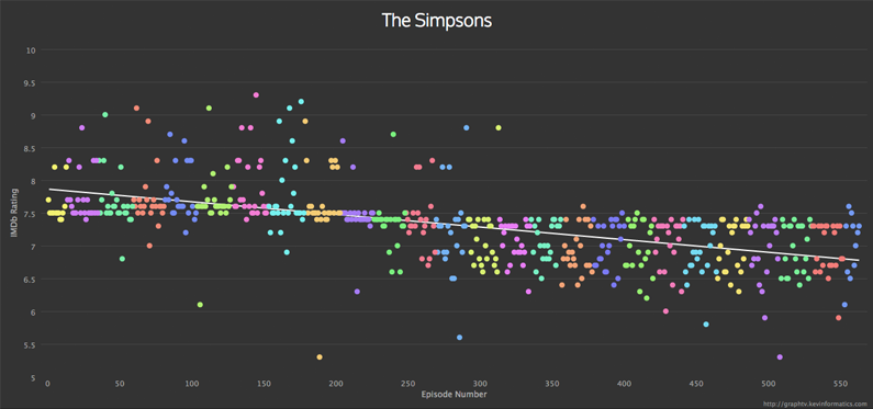
As much as I’ve argued time and time again that The Simpsons is still a quality program, it’s almost unanimously believed (and I agree) that the series has at least seen a steady decline in the past 10 to 15 years – and now there might be statistical proof.
Sort of.
Using IMDB scores of each individual episode of The Simpsons, coder Kevin Wuhoo (Side Note: Great name, right? Especially as it pertains to the show. Was his assistant “James Doh?”) turned the data into a graph that plots it & creates a trend line. And that trend is not going in a desirable direction.
Although IMDB scores are nothing new, it’s interesting to actually see the scores laid out as they are, highlighting some of the outliers – good and bad – throughout the years.
If The Simpsons don’t tickle your fancy, or you’re just especially intrigued by the process, it can be applied to other shows as well, so go nuts.
[via TechDigest.tv]


"There are also other characters that come and go (also owned by the Warner Bros. Discovery conglomerate media company)."
Huh. Is that just referring to other characters from the show itself, or is this implying that the new season is going to have cameos from other WBD IPs