


Review: Rick and Morty Super Spring Break Special #1
One of the strengths of the sequential art oeuvre put out by Oni Press is the great range of writers they score and the wide berth those writers are given to do their thing, and the first ever Rick & Morty Spring Break Special is no exception. James Asmus and Jim Festante have a history of teaming up for some pretty brutal anti-capitalist comicry, (check out Survival Street!) so it’s a safe bet that when they put together a spring-break themed Rick and Morty Spectacular, it’s going to be way more ‘Infinity Pool’ than ‘Mondo Daytona’.
And this comic is most certainly geared towards the most adult of adult audiences – it’s got quite a bit of gratuitous violence and sexual content, (it’s a pretty important plot point that Summer has a locker key stuck deep inside her ass after some sexy spring break shenanigans) backed up by some pretty hardcore questions about the legacy of colonialism. The comic is broken up into three distinct parts, each illustrated by a different artist. Despite it’s candy coloured colour scheme, this is a challenging read – there is a blunt approach to the social commentary of Spring Break Special that is reminiscent of the merciless independent comics of the early 90s. Each section pivots from the last in a natural disruption made even stronger by the variations in style brought by each of the different artists.
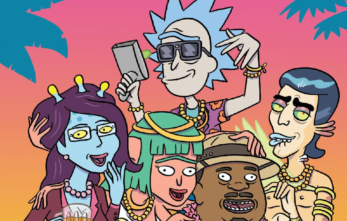
The first part is illustrated by Australian artist Dean Rankine, whose work can be found everywhere from Bongo to Dark Horse. Rankine also drew the mega-issue’s first cover option – a raucous Rick getting rowdy with the perfect spring break crew – Unity, Mr. Poopybutthole, a lady Gazorpian, Mr. Nimbus, and the mailman.
It sets up the tale of Rick and the kids heading to the Spring Break Planet (Xicemo), which interrupts Morty’s one shot at looking good in a beret for his Model UN Club.
Cover B was created by Suzi Blake, which depicts Rick winning a wet t-shirt contest, despite the fact that he’s wearing a short-sleeved button down. The three-breasted alien lady that came in second is right to be pissed-off about it. Blake’s crowd work really shines with this cover – each alien guest is getting up to its own kind of festive mayhem. I’m not sure which is weirder – the little red guy with the lava lamp spirit thing strapped to his back, or the fact that there’s an alien hitting a beer bong with a standard earth-style IPA. Either way, it’s a lot of fun! The second part of the story is illustrated by Tony Gregori, and the art style grows just a little bit creepier as things escalate on the Spring Break Planet.
There’s also a wrap around cover done by Marc Ellerby that has a whole lot of great, greasy beach action going on. Ellerby also did a number of glorious pin-ups to this super sized comic, of which my personal favourite is so many Jerrys cooking franks together while a creeped out Gazorpian watches from a safe distance.
In the world of comic books, there is a small minority of people that see variant covers as just another gimmick used to sell more funny picture books. And that is most certainly part of it. And there are also those who collect variant covers because they hope that they will become valuable someday. But a really strong cover collection can totally serve as part of the story’s narrative, before you even start reading. It can make you gravitate towards work that perhaps you hadn’t noticed before.They make the argument for going into your local comic book shop, just to take a look at all the ways different artists interpret the work contained within. They also offer a great platform for up and comers and veterans alike to show off a little bit of what makes their style special. A lot of the time, if a cover artist isn’t directly involved with the rest of the comic’s production, they will only have the vaguest idea about what the issue’s storyline will be, and, in their guessing and imaginings, a delightful dissonance is created – certain expectations are born when you see the cover of a comic book, and then the reader is disabused of these notions throughout the whole read. Just because we see Rick partying with Unity and the mailman on the cover, that doesn’t necessarily mean that that’s going to be what happens.
Which brings us to the final variant cover, by Angela Trizzino, who also illustrated the third section of the Super Spring Break Special. Unlike all the other covers, which all rock a certain Tahiti Treat colour scheme, Trizzino leans more into a YA comic pastel vibe – it’s quite clearly different from the others. It also has a hitherto unknown character front and centre – a painfully earnest looking young man named ‘Mark Skidowski’. The incongruous nature of this cover just fills you with dread. And for good reason. I won’t go into the details of this third story at all, but it finishes the story off in a devastating fashion.
Even if you can’t afford to buy all the variant covers of this comic, they’re still cool to look at. And it’s not a bad idea to pick up a second copy just to cut out Ellerby’s pin-ups!


"There are also other characters that come and go (also owned by the Warner Bros. Discovery conglomerate media company)."
Huh. Is that just referring to other characters from the show itself, or is this implying that the new season is going to have cameos from other WBD IPs